Looking for Something? : Searching the Web
Representation of Japanese Language Characters on the WWW
You are here: irt.org | Articles | World Wide Web (WWW) | Links Want To Be Links [ previous next ]
Published on: Sunday 9th January 2000 By: Jukka Korpela
This document explains why you, as a Web page author, should not try to prevent Web browsers from displaying textual links underlined and image links with borders around them. It also discusses common mistakes in setting (suggesting) colors for textual links. In special cases, it might actually help users if you "tailor" link presentation; there are both HTML and CSS methods for that. The beauty of textual links is explained and compared with the drawbacks of non-textual links and pseudo-links like buttons. Finally we present various ways of "animating" or otherwise enhancing links without destroying their natural beauty.
target |
Java pseudo-links |
"Form-based" methods: buttons and pulldown menusLinking turns texts to hypertext, and hypertextuality is among the key factors that make the World-Wide Web a web of interconnected things. Using links on your Web pages, you can conveniently let your readers find background information, technical details, definitions of terms, alternative presentations, etc., on your pages or somewhere else. You can also set up "hypertextual tables of content", and you can chain pages together using links to "previous" and "next" pages. That way you can keep the size of individual pages reasonable, which is essential for fast accessibility.
By itself, a link is a relation between things which can be documents or parts of documents or locations in documents. In other words, a link is a pointer or reference. A link does not "do" anything, just as text like "see p. 42" in a book does not do anything. It is something that can be followed, by a browser on user command, or by an indexing robot, or by some other software.
Indexing robots (aka "spiders" or "crawlers") are essential for
search engines,
which in turn are crucial for users' ability to find Web pages.
There's a lot of
talk about being "search engine friendly",
and there are widespread myths about the importance of
meta tags
and submitting your pages to search engines. But how do indexing
robots find pages? Mainly by following links. So in order to let them
find your subpages now and in the future in a natural way, use
normal links to them. Yet, many authors prefer using
fancy imitations of links ") .
.
The icon at the end of the preceding paragraph exemplifies a method of
attaching "flags" to links
in order to indicate the type of a link. Here it indicates
that the link preceding it is a forward reference, pointing
to a location later in the same document. Thus, it hopefully helps the
reader in deciding whether to follow the link or not.

|
Even if we don't count indexing robots, which follow links their own ways, following a link doesn't mean just clicking on a link and getting the linked page onto screen. Authors often ask how to open a link in a new window or how to "download" a file without "opening it on a browser". There questions reflect ignorance of what links are and how the Web works with different media types. But the situation also illustrates how misleading it is to identify a link with one common way of using links. In particular, on popular browsers, the user can use the right button of the mouse to get a menu of alternatives like "open in current window", "open in new window", and "save onto local disk". Usually authors' attempts to dictate the ways in which links can be followed will just make things more difficult.
It belongs to the very basic functionality of a Web browser to indicate links as links. How they do that may vary greatly, depending on the browser and its settings. And it belongs to the very basic skills needed in Web browsing to be able to recognize a link as displayed on one's browser and to follow a link. There is very little you can do as an ordinary Web author to improve the browsers or educate the users. What you can do is that you don't prevent browsers from doing their job or users from making use of that.
Recognizability isn't enough. In visual browsing, links should be recognizable on quick scanning. Web users' typical reading habits involve scanning for interesting headings, emphasized texts, images, and other visually distinctive material. Sometimes they (we) read texts in detail; it is even more rare to move the cursor over a particular piece of text or other material; and this answers the suggestion that users can recognize links as links from "tooltips" or from text color (and other properties) changing on "mouseover". The preceding sentence contains one word which is a link, just for illustration; it actually leads to a somewhat one-sided definition. You should have no difficulty in noticing which word is a link, just because I did nothing to suggest any particular presentation of links.
This document mainly discusses the appearance of links on visual browsers, such as Internet Explorer, Netscape Navigator, Opera, Lynx, Mosaic, and many others. They have different ways of displaying links by default, and there are several ways to change the defaults. However there are many similarities, and some browser features in this area can be regarded as so common that a Web author should usually avoid trying anything that might cause confusion in a typical browsing environment. Whether you like the colors commonly used as link indication by browser defaults is up to you - if you don't, you can change things in your browsing environment. But it is important to realize that if you use such blue colors for some texts which are not links, a very large percentage of your readers will assume that they are links and get frustrated and confused. Similarly, if you manage to prevent browsers from using their normal presentation of links, it's usually a Pyrrhic victory.
In printed matter, underlining usually indicates
emphasis. (Sometimes it could make some other distinction,
e.g. in linguistics one might underline expressions in the object
language.) For good or bad, Web browsers generally don't use such a
convention; rather, many of them by default use underlining for
links. Someone might say that this is one form of
emphasis. But indicating something as more important than normal text
is logically different from setting up a link. Some text could be
emphasized, using e.g. the
em element,
quite independently of its being or not being a link. And quite often
links are included for the same purpose as footnotes are given in
printed publications: to provide information which is, to the average
reader at least, less important than normal text!
To many people, underlining means a link. Simplistic as such
thinking can be, it's a reality. As a consequence, you should not try to use underlining for anything but
links. In particular, you should not use the
u element,
which is text-level markup for underlining. Rare exceptions to this
consist of specialities like referring, typically in a computer
program manual, to some text which is underlined on paper or on
screen, e.g. "the first item in the menu is File".
A more common problem than attempts to underline non-link texts is that authors often want to prevent browsers from underlining links. Suppressing link underlines seems to be one of the most frequently asked trivial questions on Web authoring, and it seems to be one of the most popular uses of stylesheets. It's mentioned as number 1 in the (assumably somewhat sarcastic) document 5 cheap CSS tricks at the Website Abstraction site.
Many people would agree that underlining is per se the wrong way to indicate texts as links. But it's one thing to have an opinion about browser behavior and another thing to try to force other people's browsers to behave in a certain way.
If you have a strong opinion about it, think what I would feel, as your potential reader, if I have an equally strong but opposite opinion and you manage to force me to view your page your way? (Right, I'd most probably leave your page at once.)
But there is also a very objective reason not to fight: underlining can be the only way in which a browser indicates a link as a link. Authors often think that colors do the job, but that's not something you can really count on. It is a basic accessibility requirement that one should avoid relying on colors as the only method of conveying some information. See Web Content Accessibility Guidelines, principle 2: Don't rely on color alone. The following simple examples illustrate this:
It is fairly popular among Web authors to try to suppress underlining
of links and try to re-establish it on
"mouseover" .
Well, it quite often happens that the former attempt is successful but
the latter is not. More importantly, underlining is most essential
when the link is not focused on, because it helps the user
seeing it there is something that can be
meaningfully focused on!
It has been argued that users can set their browsers to override authors' presentational "commands" if they really need to, e.g. force the browser use underlining of links if links would otherwise be indistinguishable from normal text. That's true in a sense, in most cases, but users need to know that and take the extra trouble. But generally, robust Web authoring should be prepared to having stylistic suggestions overridden by user settings, not rely on that taking place!
Naturally, you should not try to force other people's browsers to underline links on your pages either. There can be very good reasons why people have configured their browsers not to use underlines.
![[Information about dog breeds]](1.gif "Information about dog breeds") If an image is used as a link, then typical visual browsers by default
indicate it as a link by drawing borders around it. Typically the
borders are of the same color as the browser uses for textual links.
This means that visited and unvisited links are displayed in different
colors.
If an image is used as a link, then typical visual browsers by default
indicate it as a link by drawing borders around it. Typically the
borders are of the same color as the browser uses for textual links.
This means that visited and unvisited links are displayed in different
colors.
One of the most common questions on HTML
authoring is how to get rid of the "ugly border", and
the answer
is technically simple: add the attribute
border="0" into the
img tag.
This cannot force anything; browsers may still override it.
For example, the
Opera
browser lets the user specify "Always have border on image links"
rather simply, via the preferences settings. And on browsers with
sufficient support to stylesheets, e.g. on IE 4, a user can write
a user's style sheet which suggests borders around image links and
declare the suggestions as !important, to override
author's stylesheets.
 But at present the
 border="0" attribute mostly works; and
that exactly is the problem If there are no borders around an image,
the user does not see what images are links.
Browsing becomes guesswork, trial and error.
Removing the borders is even more harmful than removing
link underlines ") .
since with textual links, there's a considerable chance that they will
be seen in a color which tells the user they're links (or perhaps with
a frame around them, or something). For image links, it seems that
the border is the only way for browsers to indicate them as
links, so does it make sense to try to prevent that?
.
since with textual links, there's a considerable chance that they will
be seen in a color which tells the user they're links (or perhaps with
a frame around them, or something). For image links, it seems that
the border is the only way for browsers to indicate them as
links, so does it make sense to try to prevent that?
It has been said that users can move the cursor around to see which images are links, but that's really not a very brilliant idea. It turns immediate visual perception (via just taking a glance over the page) to a game which is not fun at all. Generally the desire to remove borders relies on the assumption that users behave or should behave in the "click on everything, it might be a link" fashion, or at least in the "don't stop waving your mouse hand, you just might see a kewl tooptip or a status line message which tells you something" fashion.
There is a particular problem associated with image links: current
browsers generally use the alt attribute to give a
"tooltip" on
mouseover.
The problem is that this is usually not compatible with the
defined meaning of the alt attribute: it
specifies the textual replacement for an image, to be
displayed in place of the image, when the image itself is not
displayed. Sometimes the same text works well both as a
replacement and as a tooltip, but generally they are two different
purposes, and attempts to write an alt text which works
as a tooltip very often defeat the basic purpose of alt
attributes. This really matters; see my see my document
Simple guidelines on using ALT texts in IMG elements.
In this paragraph, unlike in the preceding one, I have used a
workaround which helps on IE 4 (but not on Netscape): the
img element has a
title attribute,
which is for use as "tooltip". For some odd reason, IE 4 does not
use the title of the a element in this
context, so we help it a bit by writing an identical attribute for the
img element contained in it.
Normally IE 4+ displays the value of a title
attribute in a href, if present, as a tooltip. This
is a very useful feature; see
Jakob Nielsen's
alertbox
Using Link Titles to Help Users Predict Where They Are Going.
The use of images as links prevents this. The above-mentioned
workaround illogical of course since logically the title
attribute for an img element should describe the image,
not the link or the linked resource. If this sounds "puristic" to
you, consider the practical importance of good title
texts for images in the future when better tools for searching for
images by keywords are developed.
The
Icons - Balloons section of the A-1 Icon Archive
can be referred to in this way, without causing any problems in seeing
that there is a link to it. Well, you might just as well make
the image a link if you like (with border="0", since the
textual link is there anyway). But the point is that by using
textual links, optionally accompanied with
images e.g. as "eye-catchers", you avoid many problems. Here's an
additional example, from
my document on Wiio's laws
(where the image too is a link, duplicating the textual link):
See also the Dilbert comics, which often illustrate strikingly the ways in which human communication fails, especially when related to hi tech. In particular, communication between Dilbert and his boss is guaranteed to fail, since the boss has no idea of the content of the activities he "manages".
A border around an image can surely spoil the
esthetic appearance of an image to some extent; the Dilbert image
above is an example of this, since the image itself is
non-rectangular. Sometimes the effect is really bad indeed. However,
removing a vital usability feature is not a solution except
in special cases .
And it's difficult to make any constructive suggestion on how browsers
should indicate images as links in some other way, especially if they
should make the distinction between unvisited, visited, hovered, and
active links. The solution is very simple: Don't use images
as links. We'll find some exceptions to this rule, but for
the vast majority of images used as links nowadays, the best advice
is: use textual links instead, and if the image itself is somehow
useful or entertaining, let images be images, and let links
be links. You could simply write an image and a textual link, and if
they relate to each other, group them together using suitable markup.
![]() One more presentational feature needs to be mentioned here: the "selection rectangle".
On IE 4+, when an image which is a link (or an area in
client-side image map)
is clicked on, a thin dotted line appears that outlines the image or
area. This happens for textual links too. It mostly vanishes soon as
the linked resource is displayed. It can however be a nice usability
feature if there is some delay, since the user knows that the
browser is reacting to the click. If the user proceeds from one
link to another using "tabbing", then the "selection rectangle" also
appears, indicating where the focus is, which is rather essential to
know in such usage (though the browser may additionally
indicate the focus with a color change). Strangely, authors often
want to remove this nice feature! Theoretically, you could do that
using the
One more presentational feature needs to be mentioned here: the "selection rectangle".
On IE 4+, when an image which is a link (or an area in
client-side image map)
is clicked on, a thin dotted line appears that outlines the image or
area. This happens for textual links too. It mostly vanishes soon as
the linked resource is displayed. It can however be a nice usability
feature if there is some delay, since the user knows that the
browser is reacting to the click. If the user proceeds from one
link to another using "tabbing", then the "selection rectangle" also
appears, indicating where the focus is, which is rather essential to
know in such usage (though the browser may additionally
indicate the focus with a color change). Strangely, authors often
want to remove this nice feature! Theoretically, you could do that
using the
outline property
as defined in
CSS2,
and one might
consider using that property for something useful too, such
as suggesting a particular style for the outline, but it seems that no
browser supports that yet.
The hack of using the
event attribute
onfocus=
in the a tag has been suggested, and it seems to "work"
on IE 4. However, such an attribute logically says that the
element should lose focus whenever it receives focus, and the natural
interpretation (which might well be applied by future browsers) would
be that the link can never be selected! In fact, such browser
behavior for the same attribute has been observed in another context,
namely for text input fields in forms, and presented as a trick for
making the field read-only through being unselectable! Moreover, for
a link the attribute has the defined effect in the sense that the user
cannot select the link by tabbing.
Jakob Nielsen, the usability expert, wrote the alertbox Top Ten Mistakes of Web Management in 1996, making a very important point on link colors:
8. Non-Standard Link Colors
Links to pages that have not been seen by the user are blue; links to previously seen pages are purple or red. Don't mess with these colors since the ability to understand what links have been followed is one of the few navigational aides that is standard in most web browsers. Consistency is key to teaching users what the link colors mean.
In fact, red color is more typically used for active links, and due to its usual connotations it wouldn't be particularly suitable for visited links. Thus, one can say even stronger than Nielsen did: some flavor of purple is the de facto standard for visited links. This serves the additional purpose of making them less prominent than unvisited links, yet different from normal text.
In a review of the mistakes in 1999, Nielsen classifies this error as "severe" and explains it more:
Continues to be a problem since users rely on the link colors to understand what parts of the site they have visited. I often see users bounce repeatedly among a small set of pages, not knowing that they are going back to the same page again and again.
Playing with link colors just because of the author's own esthetic preferences, or ideas of what's "cool", is undoubtedly one of most obvious and most harmful symptoms of bad page design. It is often based on a misguided attempt to design a page or site which "stands on its own". But as Keith Instone has put it in his Usability Heuristics for the Web:
- - your site is not an island. Users will be jumping onto (and off of) your site from others, so you need to fit in with the rest of the Web to some degree. Custom link colors is just one example where it may work well for your site but since it could conflict with the rest of the Web, it may make your site hard to use.
There are two distinct points actually:
The best an author can do about this is to do nothing with
link colors. If however an author suggests link colors, the
suggestions should correspond to typical browser defaults:
blue (#00f in
one CSS color notation)
for unvisited links, purple (roughly #909)
for visited links, or something reasonably close to them. This is not
as good as leaving the colors alone, but it will be OK to people who
use typical browsers with default settings, and we can hope that
people who have changed the settings know how to override authors'
presentational suggestions if needed. The use of such colors for
links has implications on the overall color design of a page, to be
discussed later in the "how to" section.
Reversely, if you have decided to suggest any colors or backgrounds on your page, you should normally suggest all the link colors too. (However, a suggestion like a colored border around an element could be made as a "standalone" suggestion.) The discussion above suggests that you shouldn't deviate too much from "normal", which means rather light background and dark text. For example, suggesting black or dark blue background would imply that you can't use normal link colors. See also Colors in Dan's Web Tips. But if you decide to use dark background, make sure the text and link colors are distinguishable against it, and consider suggesting an increased font size and a sans-serif font. The reason is that text which is legible when black on white tends to become rather hard to read when white on black unless you try to help by making it sans-serif and larger than normal.
The preceding discussion may have given a bit overoptimistic idea of browsers displaying visited and unvisited links differently. The problem is that browsers have different ideas of what it means to be visited. (They have different and usually user-configurable rules for reverting a visited page to unvisited state after some period of time, but here we discuss a different issue.)
Consider a page containing links to two locations on another page, e.g. to the definition of "glyph" and description of Unicode" in my tutorial on character code issues. If you follow the first link and return, then Netscape shows the other link as unvisited but IE turns it too to visited. Which is better? Hard to tell. But it's surely sometimes inconvenient that you cannot see which locations of a page you have checked by following direct links to them.
There's nothing you can do about it in any direct way. But in site design, this is an issue to be remembered when considering whether to write one long page or a set of interlinked pages and which format is the one presented as primary to users if you have both formats. If you have relatively small interlinked pages, then the odds are that even IE's concept of "visited" corresponds to what the user has actually looked at.
Let us begin with a simple case where it might make sense to
modify link presentation, not so much for usefulness but for esthetic
reasons on which most people could agree. Assume that our page is a
thumbnail
gallery, i.e. a collection of reduced-size images which are
links to full-size versions. Colored borders might slightly distract
the user's attention from the visual content itself. And since the
distinction between visited and unvisited links isn't usually
essential in such cases, we might explicitly tell the
user that all pictures are links to full-size images and suggest
border removal. This could be done either
using the border="0" attribute
in each img element or, in a simpler way which doesn't
yet work quite that often, using just the
stylesheet
rule img {border:0;}. On the other hand, an image gallery can be just
fine even if the images have borders around them. See e.g.
EKLY's
Bird Photos
page.
As regards to removing underlines, consider the rather special case of my page containing a table of characters so that each character is a link, referring to a description of that character. It is clearly better if the characters are not underlined - especially since the table contains the low line (underline) character and some other characters for which underlining would be confusing. Naturally there is an explicit statement about the characters being links.
A different special case, somewhat analogous to a thumbnail page (where all images are links) would be a page where all words (except perhaps some headings) are links. It might be better to explain this and try to suppress the underlining, since it is inconvenient to read text where all words are underlined or otherwise different from normal text. This could be useful for language teaching and study material where every word is e.g. a link to a glossary entry. But note that e.g. the texts of the Perseus project do not apply such techniques, although most words in the texts are links. (You can read, say, Caesar's Gallic War in Latin so that almost every word is a link to information about the meaning and grammatical form of the word. Very nice if you know some Latin and wish to learn more.) In fact, the word "most" gives a hint why the technique wouldn't necessary be such a great idea. What would you do if you need to introduce words which are not links, for some reason? Moreover, if the underlining seriously bothers the user, he can probably turn it off in his browser's setting. But this example illustrates what kinds of possible reasons related to the content and structure of the page there might be to affect link presentation.
|
Finally, probably the most common reason for
affecting link presentation is to make different links look
different. As an example, consider
my attempt to create a hypertext version of an RFC.
It contains both "official" links, corresponding to references in the
RFC itself, and "unofficial" links, which I wrote to refer to
information which might be useful to readers. I'm not that happy with
the results. Basically, I need six different colors (or
actually more - we should consider "hover" colors too): two sets
of unvisited, visited, and active links. It would clearly be harmful
to remove one essential distinction when introducing another one. It
seems acceptable to use the same "active" color for both links, but
this still means five colors which must be clearly
distinguishable from each other and from other colors used on the
page. And the color scheme then becomes rather unintuitive and
difficult to remember. (An author might consider using frames to make
a legend visible permanently, but this would suffer from the usual
drawbacks of frames.)
Especially if you have created a downloadable set of pages so that people can study them offline, too, it would be very useful to distinguish between "internal" and "external" links. Internal would mean a link which refers to something within the downloadable set, and external would thus in practice mean a link which works in online use only.
Yet another distinction one might wish to make is based on the
language of the referred document. For example, a
document in Spanish and mainly intended for Spanish audience might
present links to documents in English (or generally languages other
than Spanish) differently from links to Spanish documents. This would
save those users' time who can't read English. In principle, one
could use the
hreflang attribute
and let browsers take care of the rest; but unfortunately browsers
don't even try to support that attribute. But such distinctions can
be done in a natural way by making the link text
appear in the language of the referred document. A link like
El ingenioso hidalgo don Quijote de la Mancha
suggests in a natural way that it's useful only if you know some
Spanish. In special cases, when the language is not obvious
from the link text or context, you might add a
"flag"
like [es] (or [in Spanish]) to the link. Just remember
not to use country flags!
Most methods of affecting link presentation are based on stylesheets, or CSS. To learn to use stylesheets, you need to study a good tutorial, and using them you need to consult CSS specifications and documents describing actual browser behavior. For some essential links, see my document How to use stylesheets?. Stylesheets are, by design and as actually implemented, suggestions only, and they can be ignored by browsers for various reasons, some of which have been explained in this document. The same applies to presentational HTML markup, too.
First let's mention some simple but useful HTML
methods. You can put
text-level markup
around a href elements. To emphasize a
link, you can use the
strong element
which is typically displayed in bold face. To indicate a link as less
important, you can, in the absence of more logical alternatives, use
the
small element.
You can suggest suppression of underlining by
specifying
text-decoration
: none
in a
stylesheet
.
For example, the
character table page
mentioned above uses the following technique: The table
tag has the attribute:
class="codetable"and the associated stylesheet contains the rule
.codetable tr td a {text-decoration:none; font-size:large}
which can be read as follows: if there is an element belonging to
class codetable and containing a table row containing a
cell containing an A element, please do not use any text
decoration (like underlining) and use a large font. This could in
principle be written in a simpler way, but the rule above takes some
browser bugs into account. (The increased font size is unrelated to
underlining of course, but useful in this context.)
Suppression of borders can be suggested in a
stylesheet
by assigning a zero value to the
border
property. To do that for all images on a page (be careful!),
such as for a thumbnail page, you would just write
img { border : 0; }
into a stylesheet. Normal CSS techniques
(selectors)
can be used to limit the
suppression of borders to some img elements only You
might, alternatively or additionally, put the attribute
border="0" into img elements.
You might also wish to modify the border. For
example, instead of regarding the border as a nuisance, you might
regard it as so useful that you wish to make it wider. This
might help users in distinguishing between different colors and
thereby between visited and unvisited links. If you use the
border attribute in HTML, its value must be a plain
number, interpreted as pixels. In a stylesheet, a plain number (other
than 0) must not be used; instead, you need to include a
unit,
such as px or em. If you use both the
attribute and the stylesheet property, the latter "wins", when
stylesheet support is enabled. Example (with a rather wide border,
for illustration):
<a href="http://www.free-graphics.com/icon/balloons/"
><img alt="" src="ball.gif" align="right" border="6"
style="border:solid 0.4em;"></a>
Suggesting link colors looks deceptively easy, if you
are familiar with the basics of
RGB colors.
If you use
"browser-safe" colors
only, you can use simple color notation in
CSS: #rgb where each of
r, g, b is one of 0,
3, 6, 9, c,
f (corresponding to 00, 33,
66, 99, cc, ff in
6-digit color notation), specifying the intensity of red, green, and
blue light, respectively. You can write e.g.
a:link { color : #33f; }
into a
stylesheet
to suggest that unvisited links appear in color #33f
which is a blue color slightly lighter than "pure blue" (#00f).
However, suggesting link colors the right way takes more. It's a matter of knowing the correct approach and applying it consistently. The motivation for the rules can be found in material on CSS; here we just list the rules:
a href markup.
As regards to rules 1 and 2, compare them with the reasons for the
good old recommendations to set all body attributes
in HTML markup if you set one of them. The basic idea is the same:
provide a consistent set of settings which is not
disturbed by unknown browser defaults or user settings. The colors
must "play together" to work well, so you just can't afford a
combination of your colors and some unknown colors. Other
presentational properties, like font faces and sizes, may well come
from user settings, of course, and you should not try to affect them
unless you have good reasons to that.
a:link    { color : #009; background : #fff none; }
a:visited { color : #609; background : #fff none; }
a:hover   { color : #f66; background : #fff none; }
a:active  { color : #f00; background : #fff none; }
Setting the background image explicitly to none
may look like an unnecessary precaution. But it doesn't really cost
anything, and without it you take the risk of having your link text
presented against an unpredictable background image. Perhaps some
browser vendor gets the fancy idea of supplying a default background
image, or perhaps it becomes popular among users to set such a
default, just as many people love to set desktop backgrounds!
For an explanation of what such selectors mean in detail, see the
CSS2 Specification,
sections
The link pseudo-classes: :link and :visited
and
The dynamic pseudo-classes: :hover, :active, and :focus.
The example above more or less corresponds to typical browser
defaults. Changing the color codes you can modify the presentation,
but think twice before making them very different from the defaults.
Note: a:hover settings (a
CSS2
feature) are currently supported by IE 4+ only. It is very useful
to have them though, since otherwise you would remove a usability
feature on those browsers which by default use a specific "hover"
color. (Setting the other link colors overrides that default.)
Rule 3 means, for example, that in order to strongly emphasize a link,
you put the a href markup inside the strong
markup, not vice versa. You can deviate from this, but then you should
write a more complicated style sheet which handles such nested markup
in a manner which somehow preserves the link color differences. (For
example, if a user style sheet specifies brown color for
strong elements, such differences would be lost unless
your author style sheet handles the problem.)
It is sometimes suggested that
font color
markup be used to specify font color, since
it's "plain HTML" and supposed to work on older, non-stylesheet
browsers too. This means markup like
<a href="URL"><font color="#3333ff">link text</font></a>
(nesting a and font the other way around
does not have the desired effect). This "works" on most visual
browsers (though the effect is overridden if there is a user style
sheet which suggests link colors). The fundamental problem is that
this trick
destroys the crucial distinction between unvisited and visited links .
The technique discussed above can also be used to highlight
links when they are selected by the user, i.e. to achieve
"mouseover"
effects more easily than using JavaScript. You simply specify
suitable rules for :hover pseudoelements, instead of or
in addition to the color rules discussed above. For example, you
could - as I've done for the link in this paragraph -
suggest that links turn bold on mouseover (which is for most practical
purposes the same as on hover):
a:hover { font-weight : bold; }
This could be used without any other
stylesheet
rules. It does not remove any normal browser behavior, just suggests
an additional feature. It is currently supported by IE 4+ only.
So is the :hover way works
when client-side scripting is disabled, too.
There are some relatively complicated, mixed-technique ("DHTML") methods which work on Netscape 4, too; see Martin Webb's What is So Dynamic About Dynamic HTML?, especially the example Altering Content for both Internet Explorer and Netscape 4.0. The technique works, under some conditions, even for making normal text (not link text) change properties and content on mouseover. Perhaps this applies to the heading text "Mouseover effects" above, on your browser.
Note that the CSS approach of using
:hover is limited to making stylistic
suggestions on presentation, such as changing font properties,
adding or removing underlining, etc., although this may involve
"dynamic" behavior and although there will be quite a lot of things
you can do that way, as CSS and support to it evolves. Generally, if
you wish to make things happen on mouseover, you need
to use
client-side scripting,
which imples
essential limitations
on functionality. For example, if you wish to make a separate window
pop up on mouseover, you could use a normal link
together with an onmouseover
event attribute.
A simple example (which has been applied to the preceding link): The
head part of a document might have
<script type="text/javascript"><!--
function popup() {
  window.open('popup.html','','width=300,height=150,'+
'resizable=1,screenX=300,screenY=300,top=300,left=300');}
//--></script>
and the body part might then contain
<a href="http://www.irt.org/articles/js058/"
 title="Events and Event Handlers"
 onmouseover="popup()"
>event attribute</a>
But beware that such popup windows are generally regarded as a
nuisance. At least make sure you don't leave the unexperienced user
with a window he can't close or enlargen or otherwise manipulate! For
technical information, see
JavaScript window FAQ
and
WebReference's
Window Spawning and Remotes.
If you really have meaningful use for such techniques, consider using
frames instead of popup windows. You could divide the
window into a main frame and a small "footnote frame" under it, and
use e.g. onmouseover to display explanatory texts about
links (and other elements) in the lower frame.
If you wish to suggest link colors in a manner which
distinguishes between different types of links ,
use
selectors
in your
stylesheet
.
To take a typical example, in order to distinguish between "external"
and "internal" links, you would extend our
basic example of suggesting link colors:
write e.g. the attribute class="ext" to all a
href elements which are external links, and write e.g. the
stylesheet rules
a:link { color : #009; background : #fff none; }
a:visited { color : #609; background : #fff none; }
a:hover { color : #f66; background : #fff none; }
a:active { color : #f00; background : #fff none; }
a.ext:link { color : #036; background : #fff none; }
a.ext:visited { color : #336; background : #fff none; }
a.ext:hover { color : #f66; background : #fff none; }
a.ext:active { color : #f00; background : #fff none; }
Note that the active and hover colors
are the same for all links here, but they need to specified explicitly
for external links. This is one of the pitfalls of CSS, caused by
so-called specificity rules.
Can you make multidimensional classifications of
links? Say, can you use different colors for internal and external
links and make a visual distinction between links to
tutorials and links to technical references using some other method,
say different fonts? In principle yes. But it's not easy. In
particular, it is possible in HTML to specify that an element belongs
to several classes, say class="external tutorial". But
current browsers except Opera don't support that; instead they ignore
the entire class attribute! So you would need to
introduce extra markup, e.g.
<span class="tutorial"><a href="zip.html" class="external">zip</a><span>.
As an alternative approach to making distinctions between different types of links, consider the following methods which let you avoid interfering link colors at all (i.e. you'd let colors default to what the user is accustomed to, which is almost always the optimal option):
body
{ font-family : "Times New Roman", serif; }
a.ext:link, a.ext:visited, a.ext:active, a.ext:hover
{ font-family : Verdana, Arial, Helvetica, sans-serif; }
a.ext:link, a.ext:visited, a.ext:active, a.ext:hover
{ font-weight : bold; }
The most reliable method of indicating distinctions
between different types of links is to add textual
explanations. They need not be long. You can use, say, the
string "[X]" after each external link, and put somewhere near the
beginning an explanation (legend) of the notation(s). You
might provide image alternatives for them, too (using markup
like <img alt="[X]" src="ext.gif">, but it's
probably difficult to develop good icons for such purposes in most
cases. For special purposes, icons as flags might work fine.
For icon archives, see e.g.
dmoz:
Computers:
Graphics:
Web Graphics:
Free Graphics:
Icons.
![[an image which symbolizes the AcroRead program and the PDF format]](pdf.gif) In particular, if you have links to resources in different data
formats, you might use
file type icons
which in turn could be made a link to a document which gives
information about the data format and about software for processing
it.
In particular, if you have links to resources in different data
formats, you might use
file type icons
which in turn could be made a link to a document which gives
information about the data format and about software for processing
it.
Since such "flags" are part of the normal textual content, they work on all visual browsers as well as on non-visual user agents. Note that although a legend is needed, just as you'd need one if you used a color scheme, the notation could be relatively intuitive and easy to remember, as opposite to color assignments which would be rather arbitrary.
| [?] | "quick info"; the link leads to a short description (typically, a few lines of text, perhaps with an illustration) of the concept, such as a dictionary or encyclopedia entry |
|---|---|
| [D] | definition; the link leads to a document providing a definition of the word or phrase appearing as the link text; note: [?] means informal overview for general audience whereas [D] might refer to a rigorous, or even formalized, definition |
| [R] | reference; the links refers to a detailed reference document on the topic of the text of the link |
| [T] | tutorial; the link is intended primarily for people to whom the term appearing as the link text is unknown or almost unknown |
| [L] | link list; the link leads to a document containing several different links related to the topic area of the link text |
| [B] | bibliographic data; the link refers to a document containing information about a book or other document which is mentioned as the link text, rather than the document itself |
| [->] | forward reference, to a location later in the same document |
| [<-] | backward reference, to a location preceding the current one in the same document. |
In the HTML markup, it's probably best to separate such a
notation from the preceding text by a
no-break space,
, instead of a normal space or line break, to
avoid the possibity that a line split occurs between them.
These notations would help in avoiding disappointments and waste of time. I suppose you've seen and followed links like ISO 8879 just to see that they lead basically to ordering information only, not to an online version of the document you're interested in. So [B] might help. Similarly, [<-] may help in realizing that a link leads to something you've already read. To someone who has jumped into the middle of a document, the same notation would be informative, too.
The notations [->] and [<-] don't look nice, but
they are probably the best we can achieve using short sequences of
ASCII characters. You might wish to consider using small images,
naturally with
alt="->"
and alt="<-". Or, in special occasions where you need to
assume the availability of a rich character repertoire anyway, you
might use some
Unicode
characters in the
Arrows block,
e.g. using the
numeric character references
→ and
← (denoting
rightwards arrow
→ and
leftwards arrow
←). Obviously, these "flags" would not be needed in cases where
the textual context of the link explicitly says that the link
is a forward or backward reference.
Sometimes you might make such a string itself a link, especially if
you don't want to cause a long text such as the name of a publication
to be presented in "link style". Thus, in particular, you could use
cite markup and associated stylistic suggestions and have
it followed by separate notation which acts as a link. It's probably
a good idea to make the link text appear in bold face then, because
that way the color difference between visited and unvisited link is
easier to see. Example:
HTML [R],
ISO 8879 [B].
This way you could also simulate a "multilink", i.e. a link
which would point to different documents depending on user selection:
CGI
[?]
[D]
[L]
(An obvious way to simulate a multilink is of course to write a
separate document which contains the alternatives as normal links,
with annotations, and use a normal link which refers to that
document. That approach however involves an extra step by the user in
following links.
We have presented some reasons to avoid using images as links. Here we take a more positive look: it's not basically a matter of what's wrong with image links but what's so nice about text links.
Consider the process of detecting and using a normal, textual link:
as an unvisited or visited link, unless the author has taken extra
measures to prevent that. Note that the link text appears (by
default) in normal font face and size; thus is adapts
to users preferences in this regard.
or other advisory information may pop up, too, helping the user in
making an informed decision whether to follow the link or not.
:
opening it in the current window, or in a new window, or just
downloading the resource onto the user's hard disk.
appearing and/or the link color turning to one that indicates "active"
link).
We have stated the obvious, namely the typical properties of textual links, to emphasize that other types of links or their surrogates usually lack one or more of those well-known properties. Consequently, they imply deviation from the users' normal mode of surfing. They are more restrictive, too; consider, when reading about the surrogates in the sequel, for example what you would do if you wanted to open the "linked" resource in a new window.
To make the best possible use of the beauty of
textual links,
write descriptive but concise link texts.
Obviously, texts like "Click here" don't satisfy this
requirement - and they look really stupid on paper, and
sound stupid when read aloud! There are also several other
dangerous words
which you should avoid in link texts and around them. Ideally, the
link construct
<a href="URL">link text</a>
should be written so that the URL/link text
pair makes perfect sense even in isolation. (Extracting such pairs
from a document should give a nice list of resources that the document
links to.) This is sometimes hard to achieve without making the text
look unnatural; especially in such cases, consider adding a
title attribute
as an advisory text which provides additional information.
For further illustration, let us consider some alternatives. In all
cases, we wish to link to irt.org main page, i.e.
http://www.irt.org/,
and possibly to some major subpages there, too.
You can organize sets of links in various ways, e.g. as lists or tables. To take a simple example, the following small table contains links to irt.org main page and to top level subpages as a nice, compact set:
| irt.org | Articles | FAQs | Games | Software | Books | About | Beta | Find |
|---|
One problem with such a table is that it may force horizontal scrolling if the browser window is narrow. So unless the set of links is rather small, a simple sequence of links might be better. You would just put the links into a paragraph and separate them with spaces or, preferably, with spaces and some separator characters like vertical line "|". Since it is preferable not to break a line before the separator, it's best to use a no-break space before it; and after the separator, you can use a space or a newline (which are equivalent). So the markup would be something like
<p><a href="URL1">text1</a> | <a href="URL1">text1</a>...</p>
resulting in a presentation which automatically adapts to the window width:
Articles | FAQs | Games | Software | Books | About | Beta | Find
For large collections of links, there are
several ways of organizing them e.g. into tables.
You could also use nested lists (typically, a
UL element
where the list items,
LI elements,
contain lists) especially when setting up a hierarchic table of
content; see
the ToC of a hypertext version of RFC 2396
for an example.
An unadorned textual link like irt.org is extremely suitable for normal use. It is particularly convenient when it is to appear in running text, since it has the same text size as normal text.
Text emphasis
can be applied however to create an emphasized link
like irt.org.
One could use increased font size like irt.org or even irt.org in some cases. In running text, this is usually acceptable only if the link is probably displayed at the first line.
Using a colored presentation would be more risky, for
reasons explained above,
but a careful slight change in background color might be
acceptable and useful. One might use a very light gray background like
#f6f9f6 for the document body in general and pure white
for links. This might add a feature which makes links inside running
text, say
irt.org,
to "stand out" a bit more clearly.
Fancy colors like those used on the irt.org main page itself might work in some cases, but only if it is evident that the texts are links and if it does not matter too much that the unvisited/visited distinction is lost. It does matter a lot e.g. on a page which contains a list of links leading to separate documents, like a FAQ index page, say JavaScript VFAQ page. How else could the user keep track of which answers he has consulted when trying to educate himself in general or to find an answer to a particular question? And even on basic navigational pages, such colors, suppressing the distinction between unvisited and visited links, might make life harder to first-time visitors. They have problems in figuring out how the classification of things really works; the link names often don't say much. Perhaps one could suggest that unvisited links be underlined and visited links be not underlined?
| irt.org |
There are many other variations one could apply to
textual links, like suggesting a particular font face or putting them
into boxes, either using
stylesheets
or the relatively harmless hack of using a one-cell table.
Let us then consider the use of an image, like the irt.org logo, as a link:

You should write no space or line break between the ">"
which terminates the img tag and the
</a> tag. Otherwise
some browsers display an odd spot.
This works reasonably well, if it has been designed robustly
in the sense of including a
useful alt attribute.
One might say that we
use a textual link as the starting point and fallback.
Instead of regarding the alt text as a surrogate for the
image, we start from the simple link
<a href="http://www.irt.org/">irt.org</a>
and just replace the content irt.org by the element
<img alt="irt.org" src="...">, which provides an
image alternative to the text. This way, and assuming you do
not
remove the "ugly" border,
an image link might work almost as well as a textual link.
If you have a company logo on all pages, you might make it a link to the company's main page. People might guess it could be a link and get accustomed to using it; but then you would need to make sure every occurrence of that logo is a link! Moreover, don't rely on a logo as a link. Most probably you can find a natural way of including a textual link too, e.g. by making the first occurrence of the company's name a link.
Image maps are surprisingly often used for "navigational" links, despite serious accessibility problems. In the most tragicomic cases, all information at a site is purely textual, but the only way of accessing it is via an imagemap menu, which does not work or works very clumsily in text-only mode. Image maps can be great for using geographic maps and other things which are inherently graphic and two-dimensional by their nature. But turning simple menus to image maps is generally counter-productive.
The following image map has been built from a screen capture of the irt.org main page, which contains a menu which is colored but textual.
![[irt.org links]](irtmap.gif)
If you use an imagemap, remember to include an alt
attribute for the img element as well as for each
area elements, and a title element
for each area element. This way, assuming you use
meaningful attribute values, the imagemap can be used in text-only
mode too, at least on some browsers.
Client-side scripting
can be used in many ways in conjunction with links. In fact, if you
wish to have a scripted event on your page, the way which works most
widely is to add the onclick attribute to an
a href element. But you shouldn't use that method
to set up pseudo-links which work only if JavaScript is
enabled.
A typical example is the most common (?) way of setting up a
"link" which opens a document in a new window,
a "popup" window. There is a robust way
too, so there is no reason to do it so that when considered at the
HTML level - which is what e.g. indexing robots do - it's a
dysfunctional link with
href="javascript:..."
or
href="#". So you can do such things
right
(to the extent that popup windows are right) or
wrong
(and the wrong way sometimes works).
One can also specify, or rather suggest, that a link
be opened in a new window, or in a particular named window or
frame, by using the
target attribute.
This is plain HTML and does not require JavaScript, but it's often
used either as an alternative to JavaScript popups or in conjunction
with them. Since there is a lot of misinformation about the values of
this attribute, let us summarize them:
target value | where the linked document will be displayed |
|---|---|
_blank | a new window, opened by the browser |
_top | the entire browser window, as opposite to a frame; useful for "breaking out of frames" |
_parent | the frameset which is the immediate parent of the current frame; "breaks out of frames" but one frameset nesting level only |
other values beginning with underscore "_" (e.g. _new) | invalid, should be ignored by browsers (though some browsers fail to do this) |
_self | current frame (or window); useful for overriding the effect of base target
|
a name beginning with a letter | the frame with that name, if existent; otherwise the window with that name, if existent; otherwise a new window, opened by the browser, and named so that when following a link with the same | target value later, that window will be used for it.
|
Using a normal link "enhanced" with both target and
onclick (with associated JavaScript code), you could set
up, say, a link to
irt.org
so that usually it opens in a new window, and with specific properties
if JavaScript is enabled. But even doing this in the technically
correct way, what's the point of setting up a link which can (on most
browsers) be opened only in a new window? After all,
a normal link can be opened that way and in other ways .
The most common motivation seems to be to prevent users from
"leaving a site". Such attempts easily make an
intelligent user leave the site!
The
Java language
(which is so often
confused with JavaScript)
can be used to write programs which might get executed by the
user's browser. And such a program, or applet, could be
written so that it provides a "navigational menu". It can be written
so that works in a manner similar to
image maps
but with various animations and other mouseover effects. To see such
an applet in action, see e.g.
dZiners.com - the PopUpMenuV33 Java applet.
A Java applet which creates pseudo-links that way can be written in a
manner which degrades gracefully on browsers which do not support Java
or have Java disabled. Just write the alternative menu into the
content of the
applet element.
For some reason, authors often wish to use buttons as
links. That's technically rather simple: just write a
form element
where the action attribute specifies the destination
address and the form content has a submit button with the desired
text:
This is confusing, since a button suggests form submission, which typically means at least a dynamic query, perhaps something more serious like ordering a product. If "buttonistic" approach is combined with relying on client-side scripting, i.e. if the form is non-functional when such scripting is disabled, you've gone pretty far - from usefulness and accessibility.
Another popular way to build "navigation" is to use "pulldown menus". They normally involve more than one alternative. Example:
See the document Navigational pulldown menus HTML for a discussion of both the techniques (client-side and/or server-side scripting) as well as serious arguments against the approach. It also lists reasons why normal links are superior to such menus, and most of the reasons apply to any comparison between links and pseudo-links.
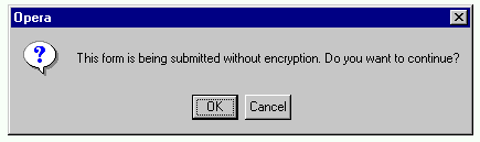
There is a special reason not to use forms in vain:
form submissions can be regarded as potentially dangerous. This
normally applies to forms using the
post method.
But a cautious user might set his browser issue a warning whenever a
form is to be posted unencrypted, and he would then get a message like
the following whenever he uses a "submit button link" or a
"navigational menu" which works through a server-side script:
Link texts could be made grow big or turn green on mouseover, in some browsing situations, as discussed above. Here we shall discuss other methods which might serve the purpose of providing additional advisory information related to links. The basic idea is to let some users get extra info without following the link. You might view this as an opportunity to "advertize" the linked resources and to allure people into following the links, or you might regard it as a method to prevent people from wasting their time (and network resources) by following links which really won't give anything to them. There need not be a contradiction: by helping people to avoid links which are useless to them, you help them to make better use of those which are useful.
The basic tool for giving such extra information
is the
title attribute,
as explained in the alertbox we already mentioned:
Using Link Titles to Help Users Predict Where They Are Going.
Since it is currently supported by IE 4+ and Opera only, you
might wish to provide some surrogates too.
One interesting technique is the one used at the lists of articles pages at irt.org, such as the page which lists all articles. The page contains, in addition to article names which are links to the articles themselves, a "Synopsis" (summary) and a "Techniques" (keywords) text for each article, below the article name. This of course means that the page is rather long. But using certain techniques one can make several browsers hide those texts and display them only on mouseover so that they appear in a box which covers part of the normal document content. So one gets a "tooltip" effect, which is rather flexible but requires somewhat complicated "DHTML" techniques.
Discussion of "DHTML", which is actually a mixture of various techniques, is beyond the scope of this article. But if you wish to study the techniques, essential ingredients include
visibility:hidden) and that no
room be reserved for it (position:absolute)
visibility value to visible on mouseover and
back to hidden on mouseout.
zIndex for IE) to make that part appear "topmost", so
that when present it covers the page content which appears in the same
area on screen.
This approach means that no new window is created, so some of the
problems of
popup windows
are avoided. On the other hand, the user cannot move the popup area to
see both its content and the text covered by it. So perhaps a method
which displays explanatory texts in a separate frame would be better.
Another, more common way to create a "tooltip-like" effect in some
browsing situations is to use the
event attributes like mouseover .
And you can do this in addition to writing a
title attribute. For example, to provide a nice link to
the document
Mammal Species of the World,
you could write:
<a href="http://nmnhwww.si.edu/msw/" title=
"Scientific information about mammal species, organized taxonomically (by order, family, subfamily, genus), by Smithsonian Institution"
onmouseover="window.status=
'Taxonomically organized info about mammal species by Smithsonian Institution'"
onmouseout="window.status=' ';return true"
><cite>Mammal Species of the World</cite></a>
On a JavaScript-enabled browser, the text "Taxonomically organized info about mammal species by Smithsonian Institution" will then appear at the status line when the cursor is on the link. Independently of this, IE 4+ and Opera display the other advisory text as a "tooltip".
Note that the text on the status line is relatively unnoticeable, and often displayed as truncated. If you wish to make the advisory text appear more strikingly, you need to use other techniques discussed.
There is also a way to use images as tooltips, if JavaScript is enabled:
Dog breeds (as per FCI classification)

The "tooltip images" might be useful e.g. to a reader who does not
quite know the English words for the breeds but recognizes breed types
from images. The example above uses just basic JavaScript techniques:
simple code for onmouseover event changes the image
(which is initially empty, i.e. completely transparent) to a specific
image, illustrating the breed, and even simpler
onmouseout code switches back to the empty image.
For other important aspects related to links in Web authoring, see especially
Looking for Something? : Searching the Web
Representation of Japanese Language Characters on the WWW
Rendering Chinese Language Characters on the World-Wide Web